Design Portfolio

Masthead

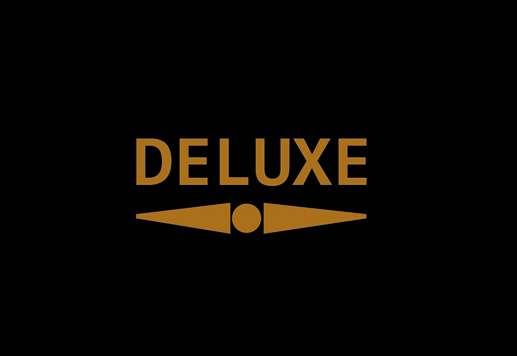
For this assignment I decided to create a fashion magazine. To begin my magazine I started with the masthead, creating something simple but effective was my goal. Using the rectangle tool to create the black background and text tool for the typography. I used colour mixing to create the gold ensuring the contrast is large between the background and text. The underlining was done by using the line tool to create my shape and then the mirror tool to ensure the proportion was exact. Then simply using the circle tool I added the final touch to create the masthead.

Typographical/Branding Standards

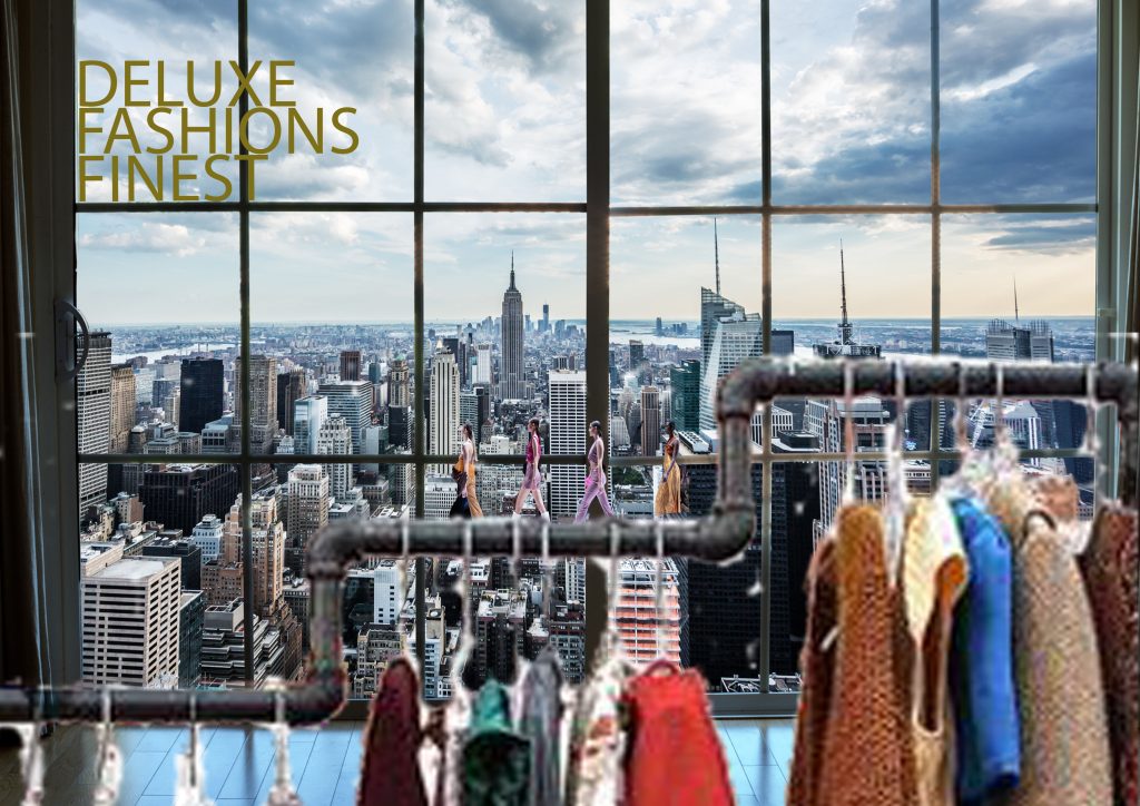
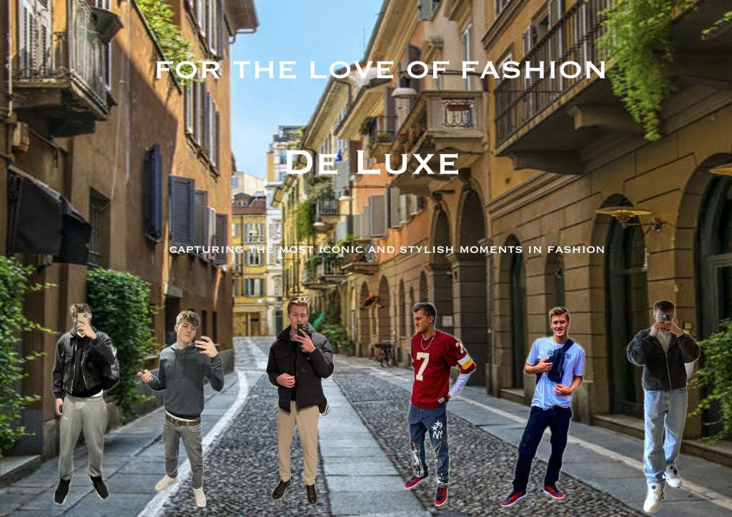
The next section contains branding and typographical standards, ensuring the style and vibe remained consistent throughout. For the first edit I used the same font and gold colour layered over an image. I then cut out the hanging rack from an image using the remove background tool, this was also the same tool used to cut the models out, which have been layered on top. I wanted to create the feeling of a catwalk or runway for the models to be stood on, the hanging rack is used to do so.

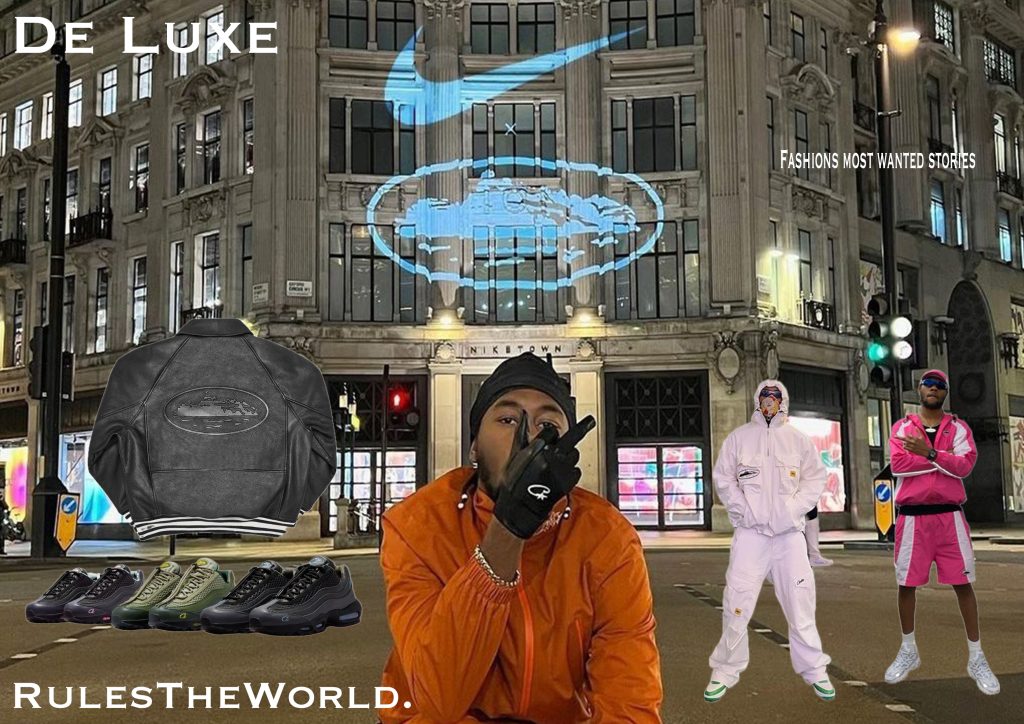
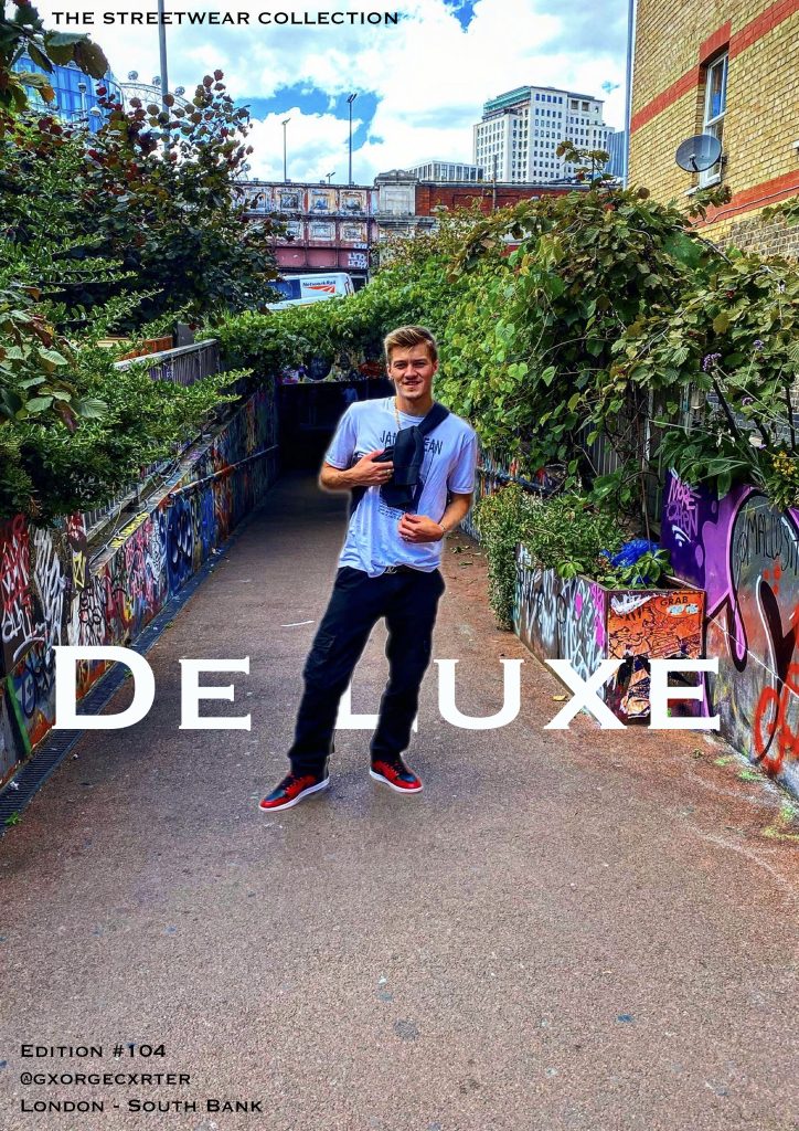
Edit 2 of this section is a more streetwear oriented page and as you can see I tweaked the font slightly whilst sticking to the style I wanted. I also used white for the text as I wanted a clear message. Throughout I have used the text spacing, stretching and moving tools to ensure it fits perfectly to the style. I used the remove background tool again to cut the images out I desired, layering them on top of an image and ensuring they were well visible.

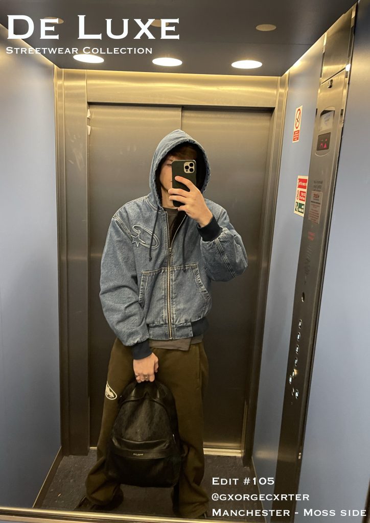
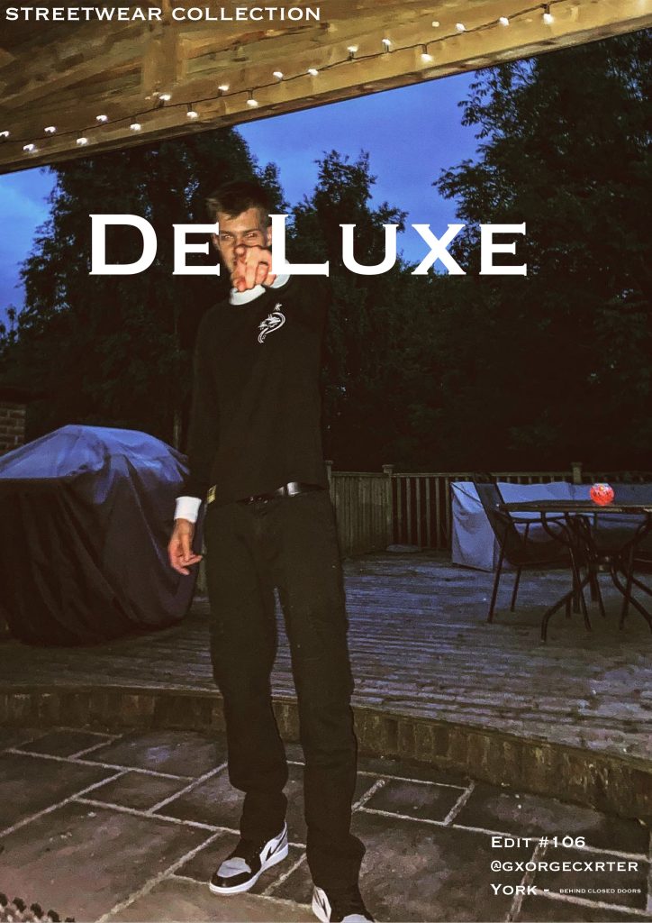
The last standards edit maintains consistency, using techniques used throughout so far. I cut images of myself out in different outfits, layering them on top of the image. I ensured the spacing was even and the size of the images was consistent. Creating the final style and vibe I wanted.

Cover Designs

For my cover designs I wanted to stay with the simple but effective style, using photos I have taken and placing typography over top. I kept the font and colour of the text the same to ensure my designs are consistent.

The first edit in this section was created by using the image as a background. I then layered text over top and a cut out of the image. This was to create the look of the text behind me. I used the remove background tool to cut myself out and then layered the image over top. The typography was placed decisively to ensure the images are clear and sticking to the vibe and style I intend.

The next two edits are similar in that typography was placed over top of the image, I wanted to create a cover that would stand out and be easy to spot from others. Using white text and a font that would stand out. This was all whilst staying consistent to the vibe and style of my fashion magazine. The cover designs are part of the streetwear collection in the magazine, there is a runway collection and a party collection.

Editorial Pages

The first CentreSpread I have designed is the Manchester Edit. This represents the colour and extravagance that Manchester has to offer, hence the bright colours used. These colours are to match the photo image used. I have used to separate images to create one large image across two pages. I have then used the rectangle tool to create the base platforms for my typography, the corners were rounded to ensure they fit with the style I intended. The rectangle tool was used again to create the text bubble in green, this was to ensure the text stood out and is clear to read. Layering has allowed me to place everything constructively and consistently. I believe that Manchester promotes character and expression within one’s self; fashion is something that allows you to create an extension of your personality and this edit is an example of this.

Second in the Editorial Page’s is the Races Day CentreSpread, this represents the luxury side of fashion. Capturing colour and elegance, the races promotes a smart but characteristic style. In this edit I have used the same font for typography however, I have used colours to provide the feeling of being at the races. Again I have used to separate images to created a CentreSpread, sprawling two pages. The text bubble has been coloured and rounded to ensure the text is very clear and readable. Layers have again allowed me to ensure the style and vibe of the edit is kept inline with the magazine and intended characteristics.

The final editorial page is simple and uses techniques performed in previous edits. I have ensured consistency is key throughout. As you can see again the text bubble is rounded and coloured to create the clear and visible text. This edit is a more informational page, intended to create desire for the magazine, using a simple image and a small story. I have tried to entice the reader/consumer into wanting more from the magazine, using just enough typography for a good read and just enough of an image to still promote fashion. The image has been layered along with the text to create another CentreSpread, sprawling two pages. Using the same font and white text again to ensure the typography is clear, visible and readable.

Development Log

Starting the Design Process for Paris Fashion Week

For this assignment, I’ve decided to focus on Paris Fashion Week, one of the most prestigious fashion events in the world. The goal is to design a website and a companion app that will help users navigate the event and stay updated on schedules, designers, and VIP access. The design needs to reflect the luxury, exclusivity, and sophistication that Paris Fashion Week embodies.

Research & Inspiration

To start, I spent some time researching Paris Fashion Week’s current digital presence. I looked at websites for other major fashion weeks like Milan and New York Fashion Week to see how they structure their websites and apps. I found that high-quality visuals are a must—big images showcasing the latest fashion collections are the focal point. I also saw a lot of minimalist designs, which I think works well for such an event. It keeps the attention on the fashion rather than distracting users with unnecessary elements.

I also checked out some moodboards for inspiration. I wanted to create a sleek, modern look that would appeal to the high-end, fashion-conscious audience. Clean layouts, monochrome color schemes with touches of gold, and elegant typography seemed to be common design trends.

User Personas

I then created a few user personas to guide my design. These personas represent the different groups of people who will be using the website and app:

• Fashion Enthusiasts: These users are excited about the fashion shows and want to know the schedule and access collections.

• Industry Professionals: They need detailed information like event timings, designer profiles, and networking opportunities.

• VIP Attendees: Expect a seamless experience for ticketing, exclusive content, and easy access to shows.

• Media: Need access to press releases, media kits, and images to cover the event.

Wireframing & Layout

I sketched out some basic wireframes for both the website and app. For the website, the homepage will focus on large images from the shows with easy links to key areas like the event schedule and designer collections. The event schedule will be displayed in a grid format, with filter options to sort by date, designer, and show type. For the app, I kept things simple, focusing on easy access to the schedule, venue maps, and push notifications to remind users of upcoming shows.

Typography & Colors

For the typography, I chose a serif font for headings, like Bodoni, which has a luxurious feel, and a sans-serif font like Helvetica Neue for body text, which is modern and easy to read. The color scheme will be minimalistic—black, white, and gold. Black and white are classic and sophisticated, and gold adds that touch of luxury.

Mid-Fidelity Designs & User Feedback

Now that I had a clearer direction, I moved on to developing mid-fidelity wireframes and started building out both the website and app designs in more detail. I also gathered feedback from a small group of users, which was really helpful in fine-tuning the designs.

Website Design Updates

For the website, I kept the hero section front and center with large images from the runway shows. The goal is for users to land on the homepage and immediately get a sense of the event’s excitement. The event schedule was one of the most important features, so I made it grid-based, with filters at the top for sorting by date, designer, and show category. This should make it easy for users to quickly find what they’re looking for.

I also added a section for designers and their collections. The idea is to give each designer their own page with a gallery of images, a brief bio, and links to their latest collections. This helps users dive deeper into the fashion aspect of the event.

App Design Updates

For the app, I kept things simple and mobile-friendly. The main screen will feature an easy-to-navigate bottom bar with icons for key areas like the schedule, map, and social media links. I also added the option for push notifications to alert users of important updates, like show times or changes in the schedule.

User Feedback

After testing these mid-fidelity designs with a few users (fashion enthusiasts, industry professionals, and even some media people), I got some good insights. The feedback was generally positive, but there were a few things to adjust:

• Website: Users thought the event schedule was a bit cluttered. They suggested adding more filters or making the schedule easier to read at a glance. I decided to move the filters to the homepage so people can easily access them without having to navigate through multiple pages.

• App: Users liked the app layout, but they suggested improving the venue map by making it more interactive. They also mentioned that being able to “star” their favorite shows would be helpful. I’ll be working on those changes next.

Refining Visual Design and Branding

With the mid-fidelity designs and feedback in place, I started refining the visual elements of the website and app to ensure they felt polished and cohesive.

Typography Refinements

I made some small adjustments to the typography, especially the weight of the serif fonts. I wanted to make sure the headings had enough impact but didn’t feel too heavy. For body text, I kept the Roboto font because it’s clean and easy to read, which is important for a user-friendly experience.

Color Scheme

I stuck to the original black, white, and gold color scheme, but I made the gold accents a bit more subtle. It still adds that luxury feel without overwhelming the design. The black and white serve as the perfect backdrop to let the content and images stand out.

Branding Integration

For branding, I added the Paris Fashion Week logo to the top of every page, making sure it’s visible but doesn’t distract from the content. I also added some subtle animations to the website to make it feel more dynamic when users hover over links or buttons.

Interactive Elements

I began integrating interactive elements into the design, like hover effects on buttons and images. This helps the website feel more engaging, and I think it adds a bit of excitement, which fits the high-energy vibe of Paris Fashion Week.

User Testing & Finalising the UI

At this stage, I’ve completed high-fidelity prototypes of both the website and app, and I’ve started testing them out to see how users interact with them.

Interactive Prototypes

I created clickable prototypes in Figma for both the website and the app. This allows me to see how users move through the content and interact with the design. I tested things like the event schedule, VIP access, and navigation between pages to ensure everything flows smoothly.

Map and Navigation Improvements

The biggest change I made was to the app’s map feature. After user feedback, I made it interactive—now, users can click on different venues within the event and get more detailed information. This was a key change because users wanted to easily find where shows were happening, especially on the go.

I also made some small tweaks to the navigation on both the app and the website. I added sticky navigation bars so users can always access key sections like the schedule and tickets without scrolling too far.

Final Adjustments and Presentation

Now that the design is nearing completion, I’ve focused on final tweaks and adjustments. I’ve made sure everything is working as expected, and I’m preparing to present the final prototype.

Final Changes

The biggest changes I made were refining the event schedule on the website to be less cluttered, improving the app’s venue maps, and making sure all interactive elements felt fluid. The website now has more intuitive navigation and the app has the added benefit of real-time notifications.

Preparing for the Final Presentation

I’m now ready to present the final designs. Both the website and the app are designed to be sleek, functional, and user-friendly, while still maintaining that luxury feel that fits with Paris Fashion Week. Overall, the process has been a lot of work, but I’m happy with the results and how everything has come together.