Masthead

For this assignment I decided to create a fashion magazine. To begin my magazine I started with the masthead, creating something simple but effective was my goal. Using the rectangle tool to create the black background and text tool for the typography. I used colour mixing to create the gold ensuring the contrast is large between the background and text. The underlining was done by using the line tool to create my shape and then the mirror tool to ensure the proportion was exact. Then simply using the circle tool I added the final touch to create the masthead.
Typographical/Branding Standards
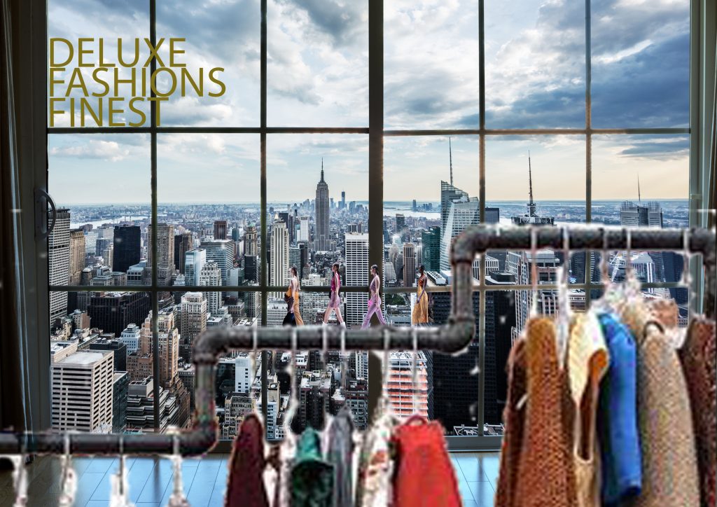
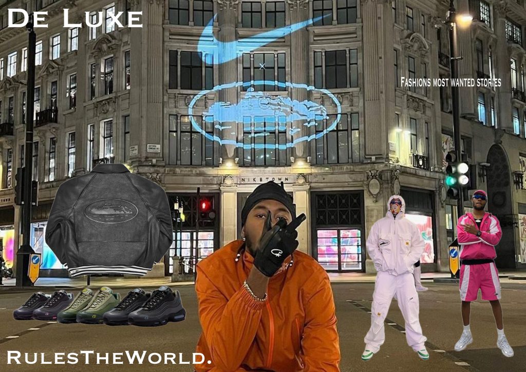
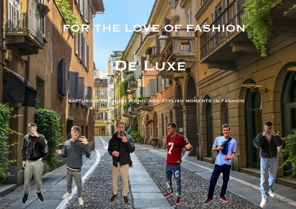
The next section contains branding and typographical standards, ensuring the style and vibe remained consistent throughout. For the first edit I used the same font and gold colour layered over an image. I then cut out the hanging rack from an image using the remove background tool, this was also the same tool used to cut the models out, which have been layered on top. I wanted to create the feeling of a catwalk or runway for the models to be stood on, the hanging rack is used to do so.
Edit 2 of this section is a more streetwear oriented page and as you can see I tweaked the font slightly whilst sticking to the style I wanted. I also used white for the text as I wanted a clear message. Throughout I have used the text spacing, stretching and moving tools to ensure it fits perfectly to the style. I used the remove background tool again to cut the images out I desired, layering them on top of an image and ensuring they were well visible.
The last standards edit maintains consistency, using techniques used throughout so far. I cut images of myself out in different outfits, layering them on top of the image. I ensured the spacing was even and the size of the images was consistent. Creating the final style and vibe I wanted.
Cover Designs
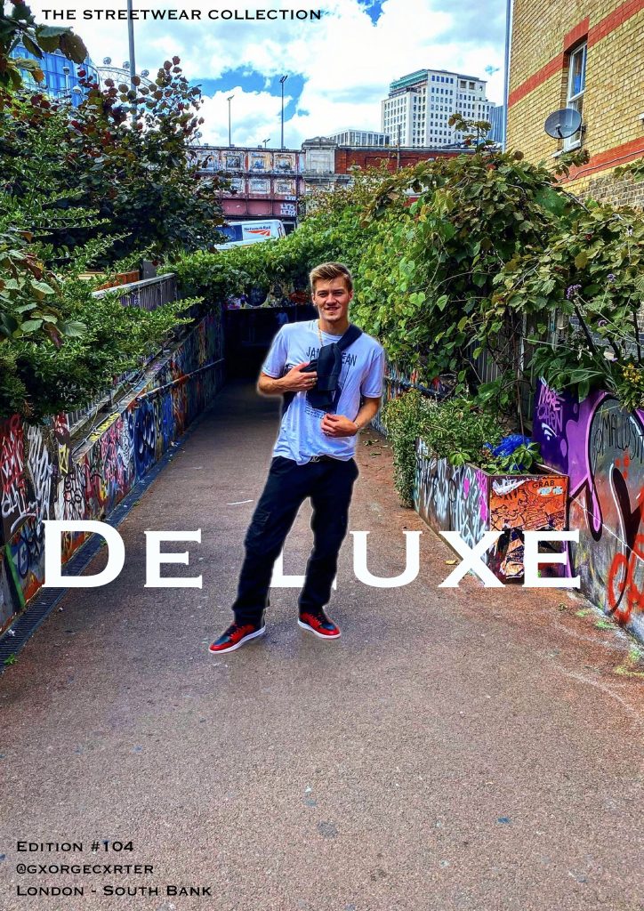
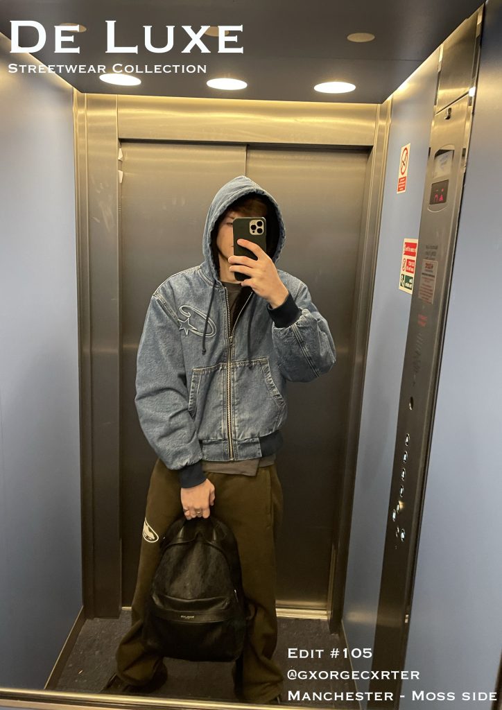
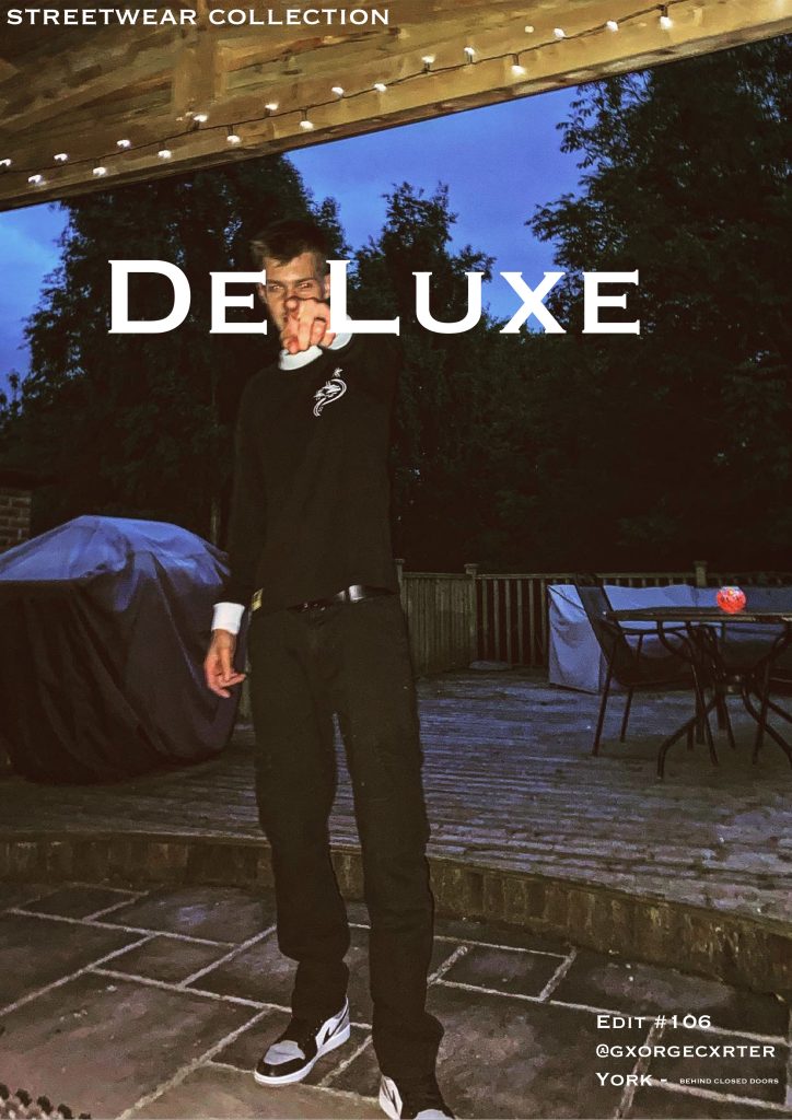
For my cover designs I wanted to stay with the simple but effective style, using photos I have taken and placing typography over top. I kept the font and colour of the text the same to ensure my designs are consistent.
The first edit in this section was created by using the image as a background. I then layered text over top and a cut out of the image. This was to create the look of the text behind me. I used the remove background tool to cut myself out and then layered the image over top. The typography was placed decisively to ensure the images are clear and sticking to the vibe and style I intend.
The next two edits are similar in that typography was placed over top of the image, I wanted to create a cover that would stand out and be easy to spot from others. Using white text and a font that would stand out. This was all whilst staying consistent to the vibe and style of my fashion magazine. The cover designs are part of the streetwear collection in the magazine, there is a runway collection and a party collection.
Editorial Pages
The first CentreSpread I have designed is the Manchester Edit. This represents the colour and extravagance that Manchester has to offer, hence the bright colours used. These colours are to match the photo image used. I have used to separate images to create one large image across two pages. I have then used the rectangle tool to create the base platforms for my typography, the corners were rounded to ensure they fit with the style I intended. The rectangle tool was used again to create the text bubble in green, this was to ensure the text stood out and is clear to read. Layering has allowed me to place everything constructively and consistently. I believe that Manchester promotes character and expression within one’s self; fashion is something that allows you to create an extension of your personality and this edit is an example of this.
Second in the Editorial Page’s is the Races Day CentreSpread, this represents the luxury side of fashion. Capturing colour and elegance, the races promotes a smart but characteristic style. In this edit I have used the same font for typography however, I have used colours to provide the feeling of being at the races. Again I have used to separate images to created a CentreSpread, sprawling two pages. The text bubble has been coloured and rounded to ensure the text is very clear and readable. Layers have again allowed me to ensure the style and vibe of the edit is kept inline with the magazine and intended characteristics.
The final editorial page is simple and uses techniques performed in previous edits. I have ensured consistency is key throughout. As you can see again the text bubble is rounded and coloured to create the clear and visible text. This edit is a more informational page, intended to create desire for the magazine, using a simple image and a small story. I have tried to entice the reader/consumer into wanting more from the magazine, using just enough typography for a good read and just enough of an image to still promote fashion. The image has been layered along with the text to create another CentreSpread, sprawling two pages. Using the same font and white text again to ensure the typography is clear, visible and readable.
