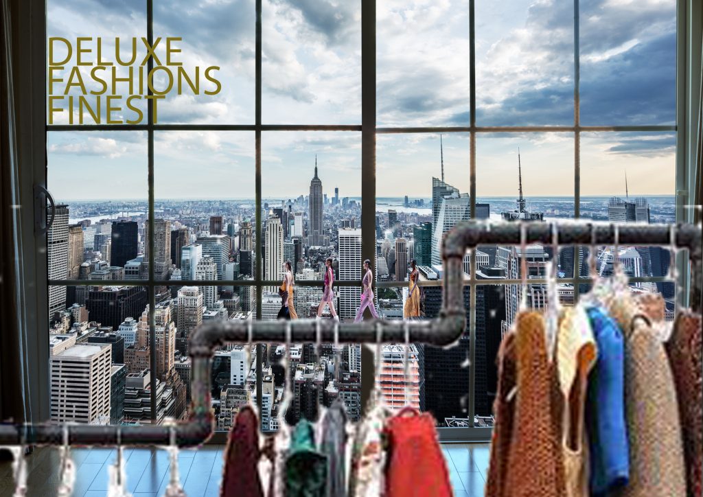
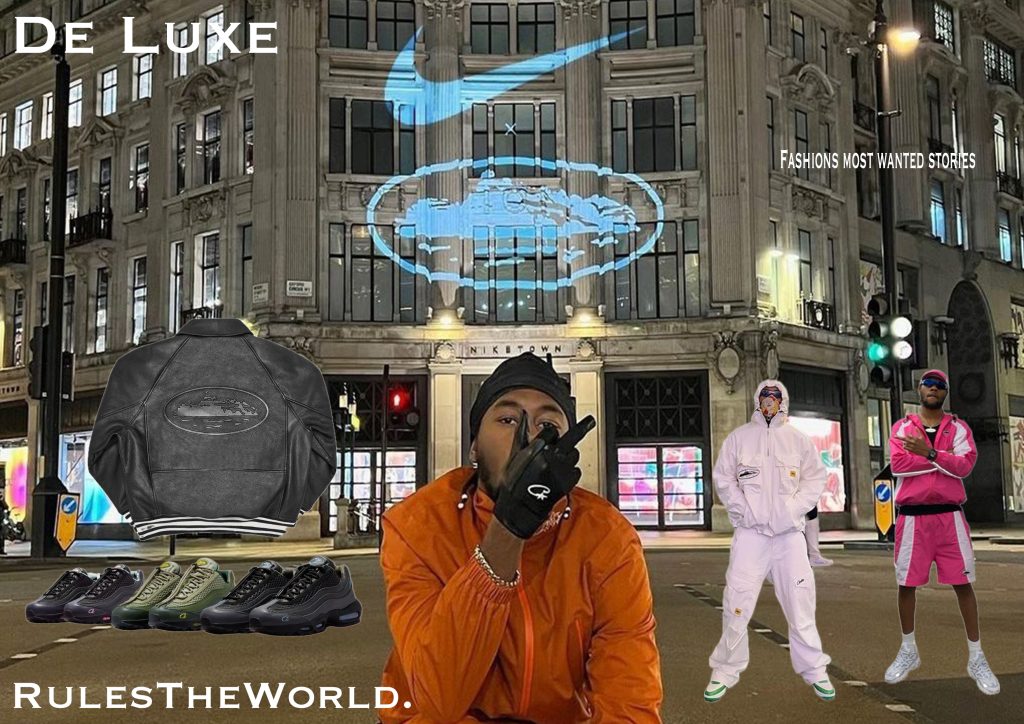
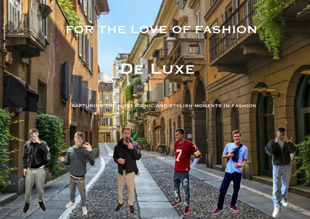
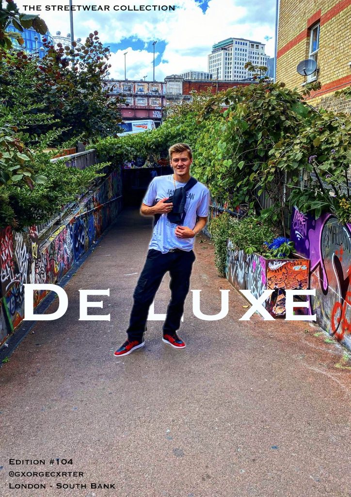
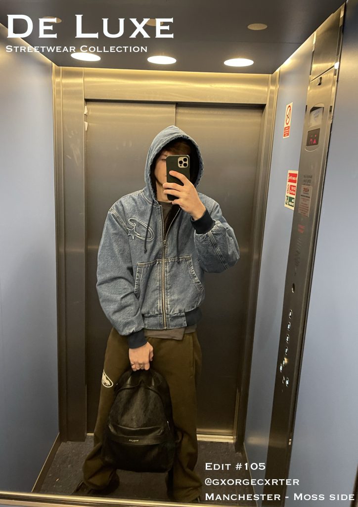
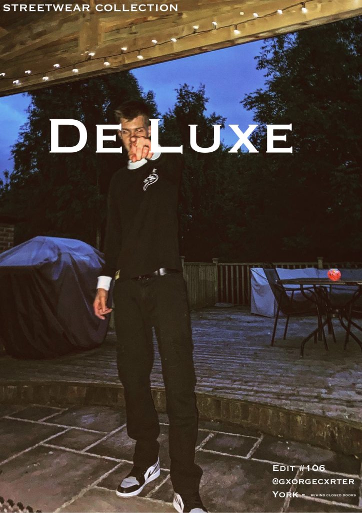
The festival/event I have chosen is Paris Fashion Week, a fashion event held every year in Paris. The event showcases the best of the best in fashion design, multiple brands and celebrities everywhere, wearing the clothes or just spectating.
Defining the UX for Paris Fashion Week
When designing a website and companion app for an event as prestigious as Paris Fashion Week (PFW), the first step is understanding the problem space. At PFW, attendees—ranging from designers and models to fashion journalists and influencers—require a seamless digital experience to enhance their event participation. The problem space, in this case, revolves around providing an accessible, informative, and engaging digital experience that mirrors the high-energy and exclusive nature of the event.
For PFW, usability goals should focus on accessibility, efficiency, and delightful interaction. For example, ease of navigation is paramount. Attendees may be attending multiple shows per day, and they will need quick access to schedules, venue maps, and event details. Their goal is to maximize their time at the event, making fast, informed decisions.
The problem space for the website differs slightly from that of the companion app. The website will serve as the primary source of detailed information, including show schedules, ticket purchasing, and designer bios. In contrast, the companion app will focus on real-time updates (e.g., live show streams or backstage content), push notifications, and personalized recommendations based on user preferences.
Thus, the problem space for both platforms addresses the same general audience but requires unique functionalities due to the differing contexts in which users interact with each.
Requirements Gathering and Analysis
For PFW, the primary audience includes attendees, media professionals, designers, and fashion enthusiasts. These users will vary in their needs; for example, industry professionals may need detailed schedules and backstage access, while attendees will likely want to know about show locations and explore brand content.
Stakeholders—such as event organizers, designers, and sponsors—will want the product to showcase the prestige of the event, enhance attendee satisfaction, and provide real-time analytics (e.g., attendance rates, social media mentions). Their success metrics will likely focus on engagement, smooth event logistics, and positive feedback from users.
To understand user needs, I analyzed similar festival websites and apps, such as the Cannes Film Festival app and Coachella’s website. These platforms highlight the importance of intuitive navigation and personalization (Hill, 2018). Feedback on festivals via forums like Reddit points to common concerns: difficulty in finding schedules, confusing navigation, and slow-loading pages. Addressing these issues will be central in my design (Reddit, 2021).
Accessibility is a key consideration, ensuring that users with disabilities can easily interact with the site and app. This includes providing alternative text for images, ensuring color contrast, and supporting screen readers (W3C, 2019).
Creating personas like “Fashion Enthusiast Emma,” a young professional attending PFW to experience the latest trends, and “Industry Insider John,” a buyer who needs real-time updates, will help guide design decisions.
UI Principles to Be Applied
UI design for PFW must adhere to well-established design laws to ensure a clean, intuitive experience. Fitts’ Law suggests that clickable elements should be large enough and placed where users naturally expect them—think of prominent navigation buttons for key sections like “Show Schedule” and “Venue Maps” (Fitts, 1954).
The interface will also follow Jakob Nielsen’s principles of consistency. Both the website and app should maintain a similar visual style and structure. This consistency is crucial for users transitioning between platforms. For example, the navigation bar should look and function similarly on both the website and app (Nielsen, 1994).
Feedback is another important aspect. If users complete an action (e.g., purchasing a ticket or selecting a show), they should receive immediate, clear confirmation—such as a visual “thank you” or a success message. The call to action (CTA), whether purchasing tickets or accessing a show, should be easily identifiable and require as few steps as possible—ideally, no more than three steps for a seamless experience (Nielsen & Loranger, 2006).
Rejected Designs
During the design process, I experimented with multiple low-fidelity prototypes. One version included an overly complex navigation bar, which had too many options, leading to user confusion. Upon testing, users felt overwhelmed and struggled to locate key features like the schedule. I chose to simplify this by streamlining the navigation, reducing it to three core sections: Events, Discover, and Tickets.
Another rejected idea was incorporating a social media feed directly on the homepage, which cluttered the interface. User feedback indicated that they wanted a clean, minimalist design to focus on event content. This led to removing the social feed and instead incorporating social media links for users to explore at their discretion.
Low Fidelity UI Prototype
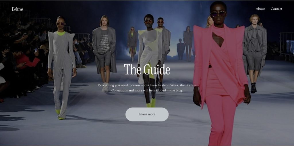
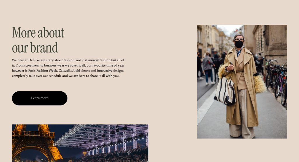
Creating a low-fidelity prototype was essential in refining the information architecture of the website and app. Using paper-based prototypes, I mapped out key screens like the homepage, show schedule, and ticket purchasing flows. The structure was designed to guide the user intuitively through the experience – whether they were purchasing tickets, exploring shows, or accessing backstage content.
One of the main challenges was mapping out the hierarchical task analysis (HTA) for the festival. What actions were users most likely to take, and how could I ensure a logical, easy-to-follow flow? For example, users would first select their event of interest, then choose the date and location, and finally proceed to ticket purchase or sharing the event with friends. This simple, step-by-step approach ensures clarity.
In summary, the low-fidelity prototype emphasised simplicity, usability, and accessibility while maintaining the stylish, exclusive aesthetic of Paris Fashion Week.
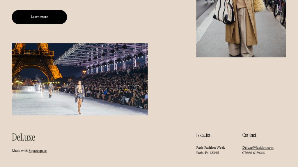
Web Prototype
References
Fitts, P. M. (1954). The Information Capacity of the Human Motor System in Controlling the Amplitude of Movement. Journal of Experimental Psychology, 47(6), 381–391.
Hill, S. (2018). The Best Event Websites and Apps We’ve Seen in 2018. [online] Available at: https://www.eventbrite.com/blog [Accessed 17 Mar. 2025].
Nielsen, J. (1994). Usability Engineering. Boston: Academic Press.
Nielsen, J., and Loranger, H. (2006). Prioritizing Web Usability. New Riders.
Reddit. (2021). Feedback on Festival Apps: Common User Complaints. [online] Available at: https://www.reddit.com/r/festivaldesigns [Accessed 17 Mar. 2025].
W3C (World Wide Web Consortium). (2019). Web Content Accessibility Guidelines (WCAG) 2.1. [online] Available at: https://www.w3.org/WAI/WCAG21/quickref [Accessed 17 Mar. 2025].

