
Figure 1
For my first Name Logo I have used the Baskerville Old Face font in a golden colourway to create a luxury aesthetic. I ensured each letter is evenly spaced and the colour was exact throughout. The style/ theme I have used is luxury and minimal, creating an expensive feel for the consumer and ensuring the brand is presented in the best way. For this logo I have used adobe illustrator, this software allowed me to create the exact logo I desired.
Personal Logo
figure 3
For this personal logo I have continued with my design in figure 1, using the name logo with a simple rectangle outline and a chamfer on the corners. This follows the luxury, minimal design theme I am looking for. I have used adobe illustrator to carefully place the rectangle around the typography. I used shapes and lines to centre the typography, this design would be the main logo for the brand. The logo can be used on all products and marketing as it is minimal and to the point, it wont distract from the centre of attention (product/marketing/advert).
Adobe Illustrator Self Portrait
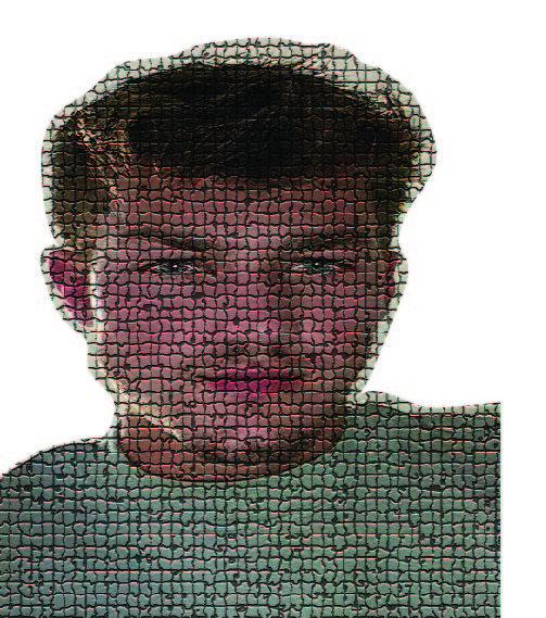
Here I have used the texture tool to create a mosaic effect over the self portrait image. I also cut around the image to allow for use on covers or other pages. With the mosaic effect I changed the size of the grout to suit the style I desired. I also made the grout as dark as possible to really bring through the mosaic effect.
Self Promotional Image Poster
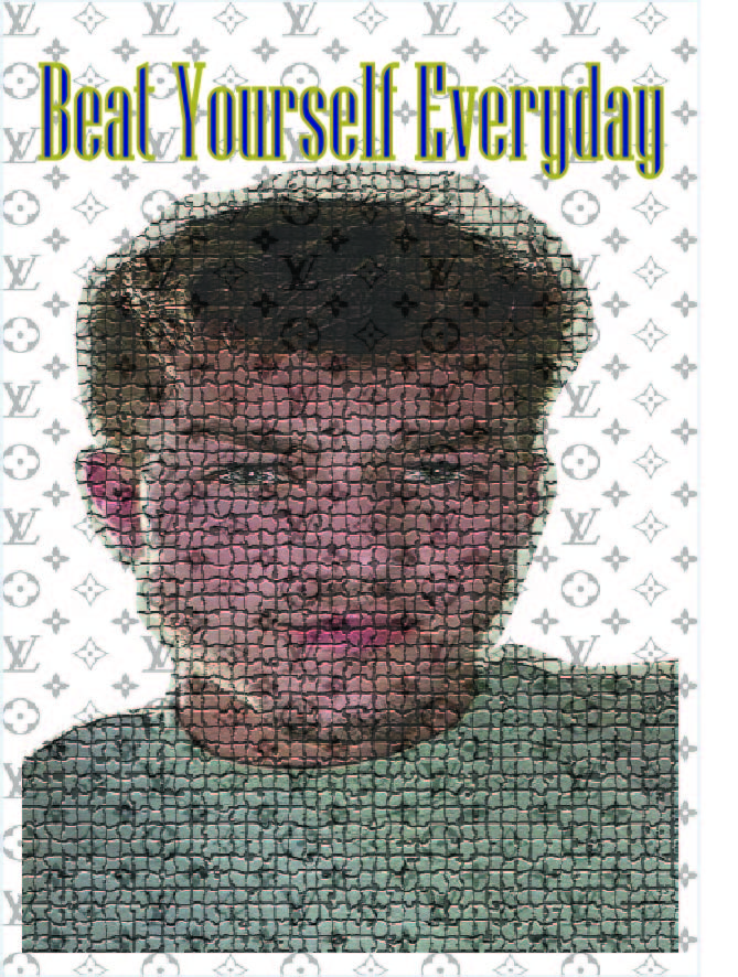
Using the same image from my self portrait, here I have created a self promotional image poster. If you can beat yourself every day, you will always be doing better. The pattern in the background is a reminder of where I would like to be, it is a designer pattern that reminds me I enjoy the luxuries in life. To be better than you were yesterday is an improvement and one step closer to reaching your goals.