
A good use of Typography
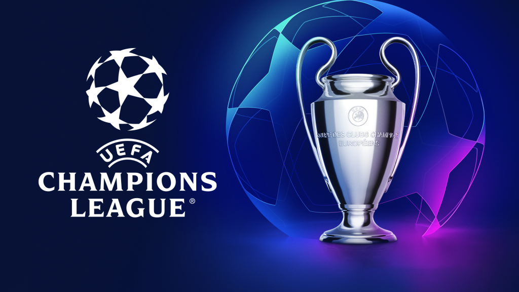
Figure 1 – Poster – UEFA Champions League – https://firstsportz.com/wp-content/uploads/2021/07/2022-UEFA-Champions-League-Final.jpg
This poster is well constructed, the use of stacking the words allows for clear reading and view of the advertisement. Champions implies the best, top of the list and this is what the competition is about. The world’s best football clubs come together in a tournament to find the champions of Europe.
The typography used here allows for the purpose of the poster to be seen clearly, it has been used well in this case. Also placing the name of the company who run the tournament at the top conveys, they hold the power, they have the ability to crown the champions. Over and underlining this also shows the importance of UEFA, not just as organisers but as rule setters and competition supervisors.
During the competition the typography used here is visible from more than just posters, it is used on the back of hi vis vests, advertising boards and generally around the stadiums of the teams in the competition.
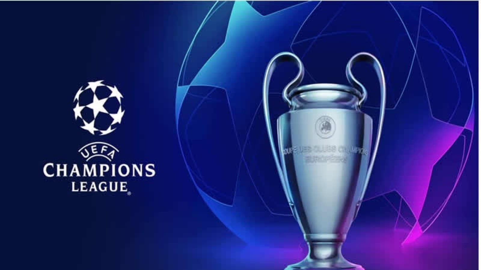
Figure 2 – Picture – Ball Advertisement – https://editorial.uefa.com/resources/0292-1c2898820924-2607a2d34c3f-1000/format/wide1/rb_leipzig_v_juventus_-_uefa_champions_league_2024_25_league_phase_md2.jpeg?imwidth=2048
In Figure 2 you can see the use of the same typography from Figure 1, the stacking, under; overlining and the bold font. However on this occasion, the colour is a complete contrast to the colours of the ball. This is to ensure it can be clearly seen at all times. Again this allows for clear view of the competition name and supervising company. This being placed on the ball does not just inform or advertise, it hooks. Everyone around the world now wants to use this football, everyone wants to play in the competition. Everyone wants to be a champion.
A bad use of Typography
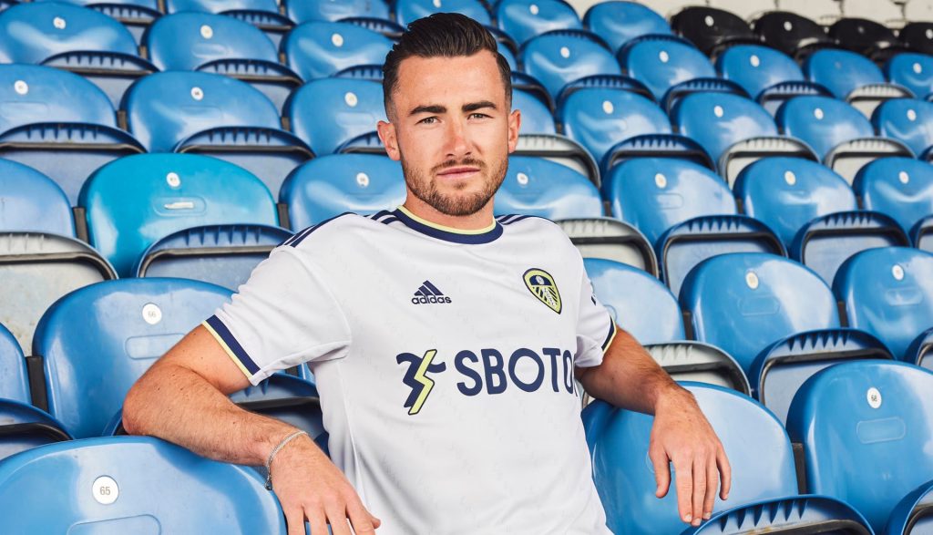
Figure 3 – Shirt Advertisement –Leeds United Reveal & Debut 22/23 Home Shirt From adidas – SoccerBible
The use of typography here is to clearly advertise the company on the shirt. However, as they are a gambling agency, the sale of shirts to anyone under the age of 18 had to be done without the typography on the shirt. Therefore the company lost out massively as a large percentage of shirts sold go to people under the age of 18 and therefore cannot have the company name on. This is not bad typography, it is just bad execution from a design perspective. A small logo or a completely different approach would resolve this, although the company name can’t be shown on the shirt. The use of advertising boards, matchday programmes, halftime interludes or even on posters on the bars, could be a better approach.
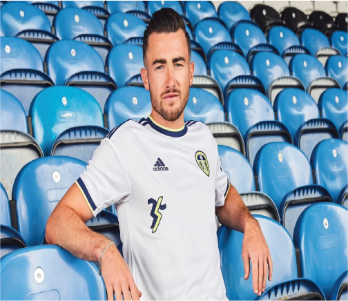
Here I have covered up the words and left the logo, children wont know what the logo is or means. However adults will, they also have the ability to find out and then even use the service they provide. I used the rectangle tool and the fill tool to create the effect of just removing the company name. You could also centralise the logo or even move it to the sleeve, this would allow for an opportunity to have other typography that suits better for the football shirt. The audience this has been aimed at are not the only people buying the shirt and as a result of this, Leeds United have now changed the sponsor allowing all ages to get the shirt. In my opinion I would of used a large logo without the name of the company, as this will allow anyone to buy the top.