
A Good Example Of Conceptual Design
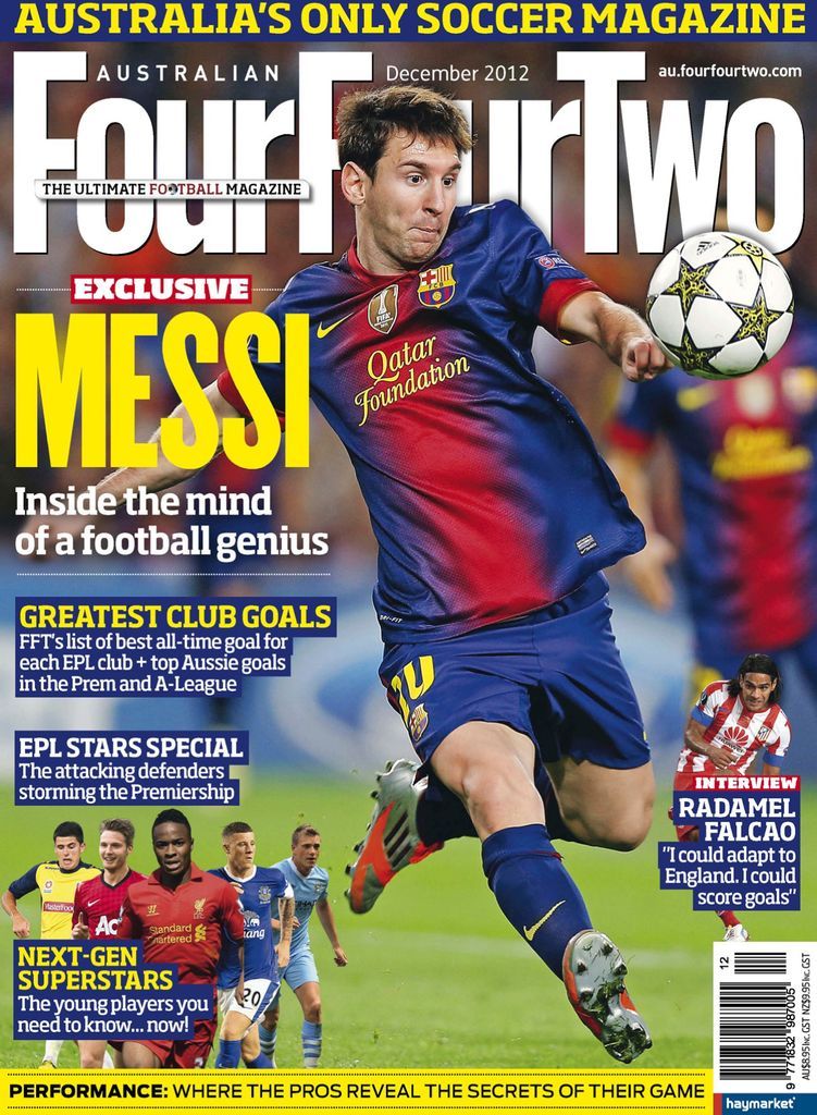
Figure 1 – Magazine Masthead – Four Four Two – Australian FourFourTwo Back Issue Dec-12 (Digital)
The magazine shown in figure one presents a great example of conceptual design used within football, Four Four Two is a formation used in game so it already suggests what the contents will be about. Any football fan will immediately gravitate towards this purely because of the masthead. Also it being placed behind Lionel Messi informs the status he holds and creates a smoother look for the image.
A smaller subheading covering part of the large text reads ‘the ultimate football magazine’ football being red and an O being a football. This being smaller but such a bold claim allows for it to sit perfectly at the top with the masthead without distracting the reader from the main focus.
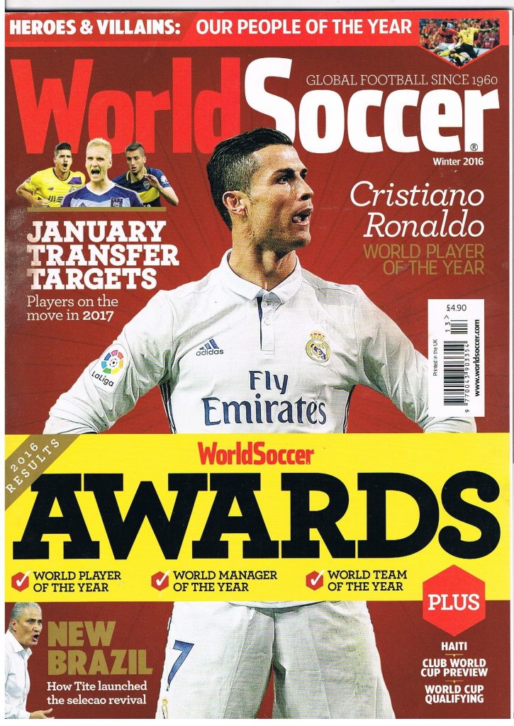
Figure 2 – Magazine Masthead – World Soccer – World Soccer Football Magazine Winter 2016 – World Soccer Awards – Vol.57 No.4
The conceptual design used here is to ensure the message of the masthead can be read. World Soccer brings attention to a global platform, not just nation wide but coverage of football world wide. As the masthead suggest this magazine covers football content from around the world, mainly covering the top leagues, players and competitions. Again the masthead being behind Cristiano Ronaldo informs the reader of his status and creates the smooth image that draws the target audience towards the magazine.
Both of the mastheads were in simple colour schemes and fonts, however they were both placed perfectly. The use of two all time greats allowed the titles to be simple yet very effective, so the reader could enjoy the image and contents. The use of the word soccer being red makes soccer stand out more to readers and catch eyes better than if the lettering was just white.
A Bad Example Of Conceptual Design
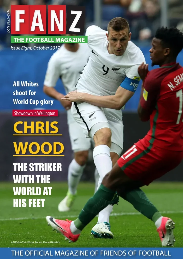
Figure 3 – Magazine Masthead – FANZ – FANZ: The Football Magazine (Issue 8) by Hurricane Press – Issuu
The conceptual design used here for the masthead may cause confusion, as the title does not immediately suggest the contents of the magazine will be about football. The masthead implies the magazine is about fans, this could be for any sport, not just football. The subtitle suggests exactly what contents the magazine holds, and therefore should be larger than the masthead. As well as the subtitle being green, which could cause readers to be differed as most of the front image is green due to the grass. This would be better suited in red or another standout colour, and the masthead could then stay in a simple colour, that creates a clearer front cover.
(Figure 4)
Figure 4 – Magazine Masthead – FANZ – FANZ: The Football Magazine (Issue 8) by Hurricane Press – Issuu – Edited by George Carter
Here I have used the rectangle tool and the type tool, on Adobe Illustrator, to create the new masthead. I have Kept the colours the same as now the green being away from the grass means there will not be an confusion or unclear typography. The main title now reading The Football Magazine and the smaller title now reading FANZ allows for readers to have a clearer tell on what the contents of the magazine holds. This is a type of conceptual design, ensuring the masthead is visible, clear and in conjunction with the contents. If FANZ used this design, I believe that they would gain more attention towards the magazine. The masthead now reading The Ultimate Football Magazine implies the contents will be about purely just football and it also implies that the contents will be better than other competitors. It creates a mystery for the reader and draws them towards the magazine.