
A Good Example Of Colour
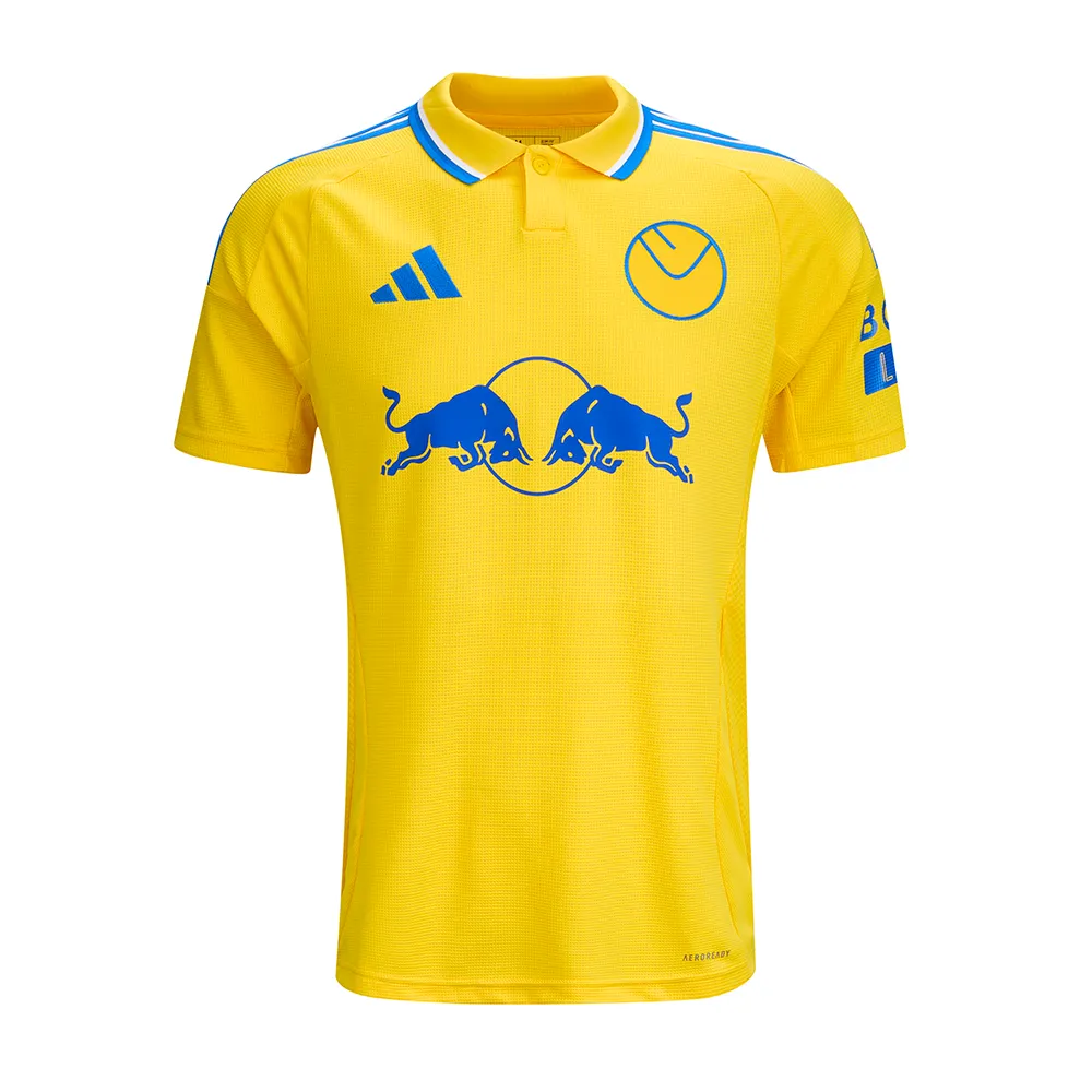
Figure 1 – Leeds United Away Shirt 2024/25 – Leeds United FC – 24/25 ADULT AWAY JERSEY | Leeds United FC Official Retail Website
Figure 1 is a great example of colour used within football, the main, large sponsor of the shirt is Red Bull. Their logo is usually has red on it, however here they have used all blue as it goes much better with the colour way of the shirt. They also used blue, because of the backlash Red Bull received for using red on the Leeds home shirt, Leeds United have a bad relationship with many teams, one being Manchester United. Their kit is red. Hence why the Leeds United fans were outraged with the red logo being on the shirt. Red Bull took this in mind and created the blue logo for this new iconic away shirt. This shirt also follows the retro style, that is very popular on the market today.
The design of the shirt is overall quite simple, however the use of colour in the right places has created this iconic look. All yellow with blue and white accents follows the Leeds colours perfectly, and it creates aura for the shirt. Because of the simplicity, the shirt is recognisable to all football fans, not just Leeds fans, and the growing popularity of Leeds means this shirt is one to be remembered. Being a Leeds fan myself, I can safely say that this iconic shirt makes up for any bad designs previous and even sometimes the bad performances from Leeds.