
Colour
A Good Example Of Colour
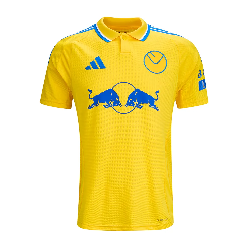
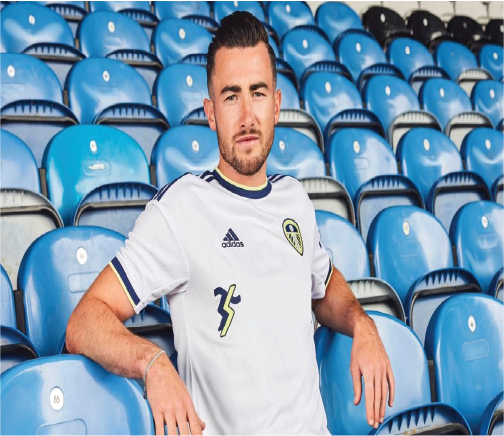
Figure 1 – Leeds United Away Shirt 2024/25 – Leeds United FC – 24/25 ADULT AWAY JERSEY | Leeds United FC Official Retail Website
Figure 1 is a great example of colour used within football, the main, large sponsor of the shirt is Red Bull. Their logo is usually has red on it, however here they have used all blue as it goes much better with the colour way of the shirt. They also used blue, because of the backlash Red Bull received for using red on the Leeds home shirt, Leeds United have a bad relationship with many teams, one being Manchester United. Their kit is red. Hence why the Leeds United fans were outraged with the red logo being on the shirt. Red Bull took this in mind and created the blue logo for this new iconic away shirt. This shirt also follows the retro style, that is very popular on the market today.
The design of the shirt is overall quite simple, however the use of colour in the right places has created this iconic look. All yellow with blue and white accents follows the Leeds colours perfectly, and it creates aura for the shirt. Because of the simplicity, the shirt is recognisable to all football fans, not just Leeds fans, and the growing popularity of Leeds means this shirt is one to be remembered. Being a Leeds fan myself, I can safely say that this iconic shirt makes up for any bad designs previous and even sometimes the bad performances from Leeds.
Conceptual Design
A Good Example Of Conceptual Design
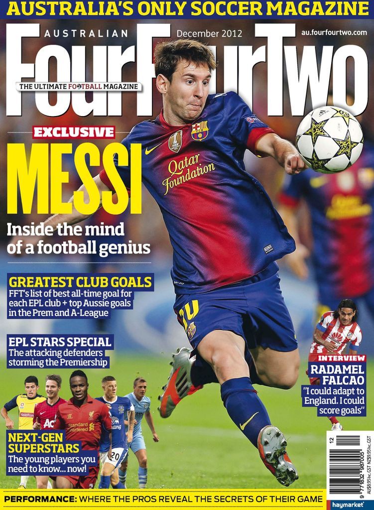
Figure 1 – Magazine Masthead – Four Four Two – Australian FourFourTwo Back Issue Dec-12 (Digital)
The magazine shown in figure one presents a great example of conceptual design used within football, Four Four Two is a formation used in game so it already suggests what the contents will be about. Any football fan will immediately gravitate towards this purely because of the masthead. Also it being placed behind Lionel Messi informs the status he holds and creates a smoother look for the image.
A smaller subheading covering part of the large text reads ‘the ultimate football magazine’ football being red and an O being a football. This being smaller but such a bold claim allows for it to sit perfectly at the top with the masthead without distracting the reader from the main focus.
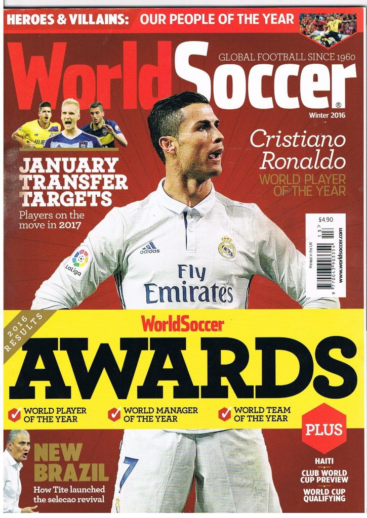
Figure 2 – Magazine Masthead – World Soccer – World Soccer Football Magazine Winter 2016 – World Soccer Awards – Vol.57 No.4
The conceptual design used here is to ensure the message of the masthead can be read. World Soccer brings attention to a global platform, not just nation wide but coverage of football world wide. As the masthead suggest this magazine covers football content from around the world, mainly covering the top leagues, players and competitions. Again the masthead being behind Cristiano Ronaldo informs the reader of his status and creates the smooth image that draws the target audience towards the magazine.
Both of the mastheads were in simple colour schemes and fonts, however they were both placed perfectly. The use of two all time greats allowed the titles to be simple yet very effective, so the reader could enjoy the image and contents. The use of the word soccer being red makes soccer stand out more to readers and catch eyes better than if the lettering was just white.
A Bad Example Of Conceptual Design
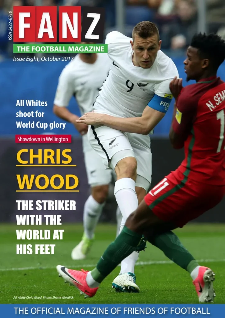
Figure 3 – Magazine Masthead – FANZ – FANZ: The Football Magazine (Issue 8) by Hurricane Press – Issuu
The conceptual design used here for the masthead may cause confusion, as the title does not immediately suggest the contents of the magazine will be about football. The masthead implies the magazine is about fans, this could be for any sport, not just football. The subtitle suggests exactly what contents the magazine holds, and therefore should be larger than the masthead. As well as the subtitle being green, which could cause readers to be differed as most of the front image is green due to the grass. This would be better suited in red or another standout colour, and the masthead could then stay in a simple colour, that creates a clearer front cover.
(Figure 4)
Figure 4 – Magazine Masthead – FANZ – FANZ: The Football Magazine (Issue 8) by Hurricane Press – Issuu – Edited by George Carter
Here I have used the rectangle tool and the type tool, on Adobe Illustrator, to create the new masthead. I have Kept the colours the same as now the green being away from the grass means there will not be an confusion or unclear typography. The main title now reading The Football Magazine and the smaller title now reading FANZ allows for readers to have a clearer tell on what the contents of the magazine holds. This is a type of conceptual design, ensuring the masthead is visible, clear and in conjunction with the contents. If FANZ used this design, I believe that they would gain more attention towards the magazine. The masthead now reading The Ultimate Football Magazine implies the contents will be about purely just football and it also implies that the contents will be better than other competitors. It creates a mystery for the reader and draws them towards the magazine.
Typography
A good use of Typography
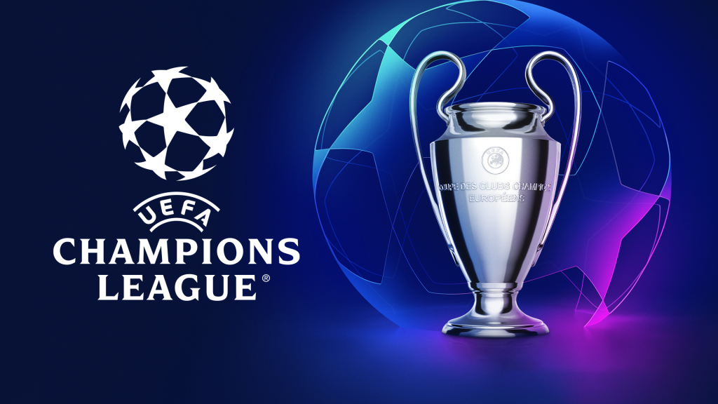
Figure 1 – Poster – UEFA Champions League – https://firstsportz.com/wp-content/uploads/2021/07/2022-UEFA-Champions-League-Final.jpg
This poster is well constructed, the use of stacking the words allows for clear reading and view of the advertisement. Champions implies the best, top of the list and this is what the competition is about. The world’s best football clubs come together in a tournament to find the champions of Europe.
The typography used here allows for the purpose of the poster to be seen clearly, it has been used well in this case. Also placing the name of the company who run the tournament at the top conveys, they hold the power, they have the ability to crown the champions. Over and underlining this also shows the importance of UEFA, not just as organisers but as rule setters and competition supervisors.
During the competition the typography used here is visible from more than just posters, it is used on the back of hi vis vests, advertising boards and generally around the stadiums of the teams in the competition.
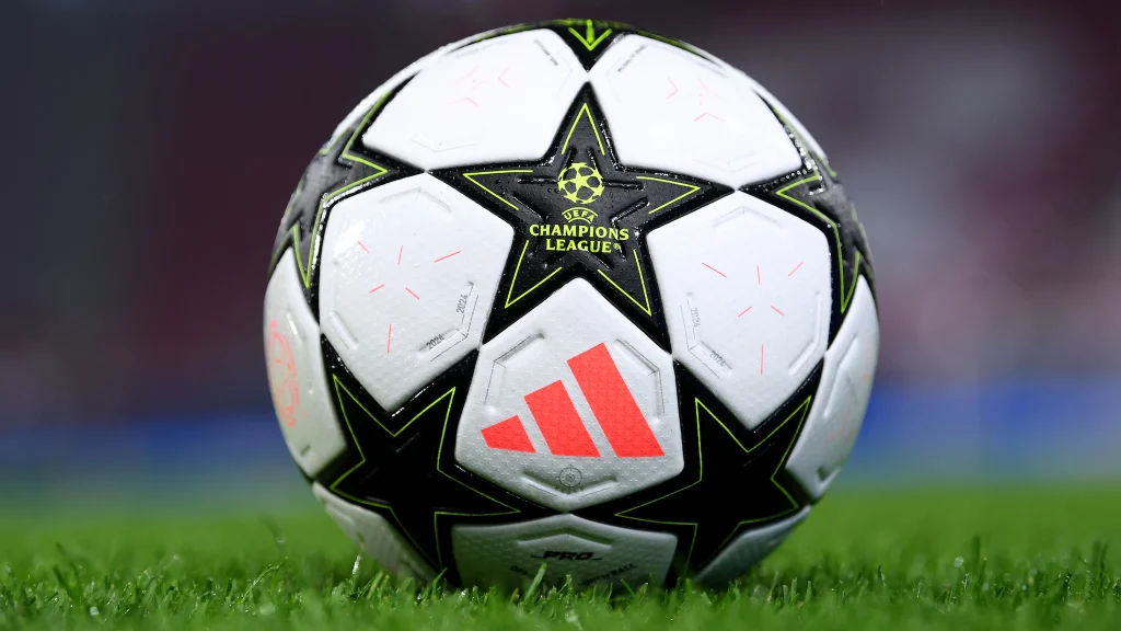
Figure 2 – Picture – Ball Advertisement – https://editorial.uefa.com/resources/0292-1c2898820924-2607a2d34c3f-1000/format/wide1/rb_leipzig_v_juventus_-_uefa_champions_league_2024_25_league_phase_md2.jpeg?imwidth=2048
In Figure 2 you can see the use of the same typography from Figure 1, the stacking, under; overlining and the bold font. However on this occasion, the colour is a complete contrast to the colours of the ball. This is to ensure it can be clearly seen at all times. Again this allows for clear view of the competition name and supervising company. This being placed on the ball does not just inform or advertise, it hooks. Everyone around the world now wants to use this football, everyone wants to play in the competition. Everyone wants to be a champion.
A bad use of Typography
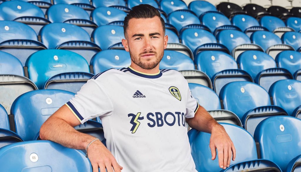
Figure 3 – Shirt Advertisement –Leeds United Reveal & Debut 22/23 Home Shirt From adidas – SoccerBible
The use of typography here is to clearly advertise the company on the shirt. However, as they are a gambling agency, the sale of shirts to anyone under the age of 18 had to be done without the typography on the shirt. Therefore the company lost out massively as a large percentage of shirts sold go to people under the age of 18 and therefore cannot have the company name on. This is not bad typography, it is just bad execution from a design perspective. A small logo or a completely different approach would resolve this, although the company name can’t be shown on the shirt. The use of advertising boards, matchday programmes, halftime interludes or even on posters on the bars, could be a better approach.
Here I have covered up the words and left the logo, children wont know what the logo is or means. However adults will, they also have the ability to find out and then even use the service they provide. I used the rectangle tool and the fill tool to create the effect of just removing the company name. You could also centralise the logo or even move it to the sleeve, this would allow for an opportunity to have other typography that suits better for the football shirt. The audience this has been aimed at are not the only people buying the shirt and as a result of this, Leeds United have now changed the sponsor allowing all ages to get the shirt. In my opinion I would of used a large logo without the name of the company, as this will allow anyone to buy the top.