User Interface & User Experience

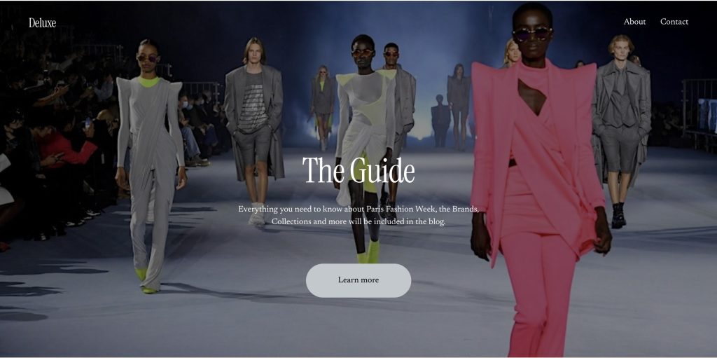
The festival/event I have chosen is Paris Fashion Week, a fashion event held every year in Paris. The event showcases the best of the best in fashion design, multiple brands and celebrities everywhere, wearing the clothes or just spectating.

Defining the UX for Paris Fashion Week

When designing a website and companion app for an event as prestigious as Paris Fashion Week (PFW), the first step is understanding the problem space. At PFW, attendees—ranging from designers and models to fashion journalists and influencers—require a seamless digital experience to enhance their event participation. The problem space, in this case, revolves around providing an accessible, informative, and engaging digital experience that mirrors the high-energy and exclusive nature of the event.

For PFW, usability goals should focus on accessibility, efficiency, and delightful interaction. For example, ease of navigation is paramount. Attendees may be attending multiple shows per day, and they will need quick access to schedules, venue maps, and event details. Their goal is to maximize their time at the event, making fast, informed decisions.

The problem space for the website differs slightly from that of the companion app. The website will serve as the primary source of detailed information, including show schedules, ticket purchasing, and designer bios. In contrast, the companion app will focus on real-time updates (e.g., live show streams or backstage content), push notifications, and personalized recommendations based on user preferences.

Thus, the problem space for both platforms addresses the same general audience but requires unique functionalities due to the differing contexts in which users interact with each.

Requirements Gathering and Analysis

For PFW, the primary audience includes attendees, media professionals, designers, and fashion enthusiasts. These users will vary in their needs; for example, industry professionals may need detailed schedules and backstage access, while attendees will likely want to know about show locations and explore brand content.

Stakeholders—such as event organizers, designers, and sponsors—will want the product to showcase the prestige of the event, enhance attendee satisfaction, and provide real-time analytics (e.g., attendance rates, social media mentions). Their success metrics will likely focus on engagement, smooth event logistics, and positive feedback from users.

To understand user needs, I analyzed similar festival websites and apps, such as the Cannes Film Festival app and Coachella’s website. These platforms highlight the importance of intuitive navigation and personalization (Hill, 2018). Feedback on festivals via forums like Reddit points to common concerns: difficulty in finding schedules, confusing navigation, and slow-loading pages. Addressing these issues will be central in my design (Reddit, 2021).

Accessibility is a key consideration, ensuring that users with disabilities can easily interact with the site and app. This includes providing alternative text for images, ensuring color contrast, and supporting screen readers (W3C, 2019).

Creating personas like “Fashion Enthusiast Emma,” a young professional attending PFW to experience the latest trends, and “Industry Insider John,” a buyer who needs real-time updates, will help guide design decisions.

UI Principles to Be Applied

UI design for PFW must adhere to well-established design laws to ensure a clean, intuitive experience. Fitts’ Law suggests that clickable elements should be large enough and placed where users naturally expect them—think of prominent navigation buttons for key sections like “Show Schedule” and “Venue Maps” (Fitts, 1954).

The interface will also follow Jakob Nielsen’s principles of consistency. Both the website and app should maintain a similar visual style and structure. This consistency is crucial for users transitioning between platforms. For example, the navigation bar should look and function similarly on both the website and app (Nielsen, 1994).

Feedback is another important aspect. If users complete an action (e.g., purchasing a ticket or selecting a show), they should receive immediate, clear confirmation—such as a visual “thank you” or a success message. The call to action (CTA), whether purchasing tickets or accessing a show, should be easily identifiable and require as few steps as possible—ideally, no more than three steps for a seamless experience (Nielsen & Loranger, 2006).

Rejected Designs

During the design process, I experimented with multiple low-fidelity prototypes. One version included an overly complex navigation bar, which had too many options, leading to user confusion. Upon testing, users felt overwhelmed and struggled to locate key features like the schedule. I chose to simplify this by streamlining the navigation, reducing it to three core sections: Events, Discover, and Tickets.

Another rejected idea was incorporating a social media feed directly on the homepage, which cluttered the interface. User feedback indicated that they wanted a clean, minimalist design to focus on event content. This led to removing the social feed and instead incorporating social media links for users to explore at their discretion.

Low Fidelity UI Prototype

Creating a low-fidelity prototype was essential in refining the information architecture of the website and app. Using paper-based prototypes, I mapped out key screens like the homepage, show schedule, and ticket purchasing flows. The structure was designed to guide the user intuitively through the experience – whether they were purchasing tickets, exploring shows, or accessing backstage content.

One of the main challenges was mapping out the hierarchical task analysis (HTA) for the festival. What actions were users most likely to take, and how could I ensure a logical, easy-to-follow flow? For example, users would first select their event of interest, then choose the date and location, and finally proceed to ticket purchase or sharing the event with friends. This simple, step-by-step approach ensures clarity.

In summary, the low-fidelity prototype emphasised simplicity, usability, and accessibility while maintaining the stylish, exclusive aesthetic of Paris Fashion Week.
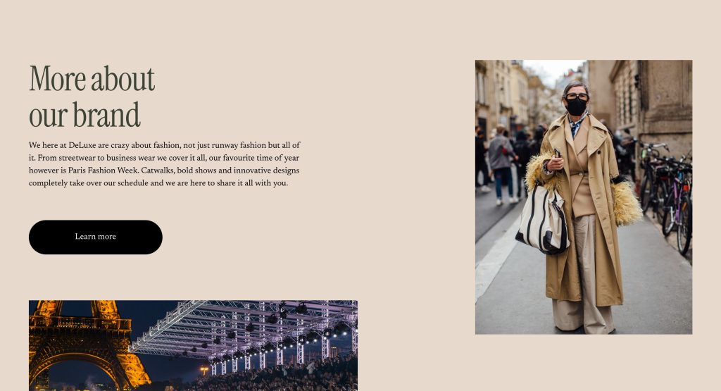
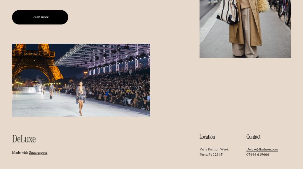
Web Prototype

References

Fitts, P. M. (1954). The Information Capacity of the Human Motor System in Controlling the Amplitude of Movement. Journal of Experimental Psychology, 47(6), 381–391.

Hill, S. (2018). The Best Event Websites and Apps We’ve Seen in 2018. [online] Available at: https://www.eventbrite.com/blog [Accessed 17 Mar. 2025].

Nielsen, J. (1994). Usability Engineering. Boston: Academic Press.

Nielsen, J., and Loranger, H. (2006). Prioritizing Web Usability. New Riders.

Reddit. (2021). Feedback on Festival Apps: Common User Complaints. [online] Available at: https://www.reddit.com/r/festivaldesigns [Accessed 17 Mar. 2025].

W3C (World Wide Web Consortium). (2019). Web Content Accessibility Guidelines (WCAG) 2.1. [online] Available at: https://www.w3.org/WAI/WCAG21/quickref [Accessed 17 Mar. 2025].

Design Portfolio

Masthead

For this assignment I decided to create a fashion magazine. To begin my magazine I started with the masthead, creating something simple but effective was my goal. Using the rectangle tool to create the black background and text tool for the typography. I used colour mixing to create the gold ensuring the contrast is large between the background and text. The underlining was done by using the line tool to create my shape and then the mirror tool to ensure the proportion was exact. Then simply using the circle tool I added the final touch to create the masthead.

Typographical/Branding Standards

The next section contains branding and typographical standards, ensuring the style and vibe remained consistent throughout. For the first edit I used the same font and gold colour layered over an image. I then cut out the hanging rack from an image using the remove background tool, this was also the same tool used to cut the models out, which have been layered on top. I wanted to create the feeling of a catwalk or runway for the models to be stood on, the hanging rack is used to do so.

Edit 2 of this section is a more streetwear oriented page and as you can see I tweaked the font slightly whilst sticking to the style I wanted. I also used white for the text as I wanted a clear message. Throughout I have used the text spacing, stretching and moving tools to ensure it fits perfectly to the style. I used the remove background tool again to cut the images out I desired, layering them on top of an image and ensuring they were well visible.

The last standards edit maintains consistency, using techniques used throughout so far. I cut images of myself out in different outfits, layering them on top of the image. I ensured the spacing was even and the size of the images was consistent. Creating the final style and vibe I wanted.

Cover Designs

For my cover designs I wanted to stay with the simple but effective style, using photos I have taken and placing typography over top. I kept the font and colour of the text the same to ensure my designs are consistent.

The first edit in this section was created by using the image as a background. I then layered text over top and a cut out of the image. This was to create the look of the text behind me. I used the remove background tool to cut myself out and then layered the image over top. The typography was placed decisively to ensure the images are clear and sticking to the vibe and style I intend.

The next two edits are similar in that typography was placed over top of the image, I wanted to create a cover that would stand out and be easy to spot from others. Using white text and a font that would stand out. This was all whilst staying consistent to the vibe and style of my fashion magazine. The cover designs are part of the streetwear collection in the magazine, there is a runway collection and a party collection.

Editorial Pages

The first CentreSpread I have designed is the Manchester Edit. This represents the colour and extravagance that Manchester has to offer, hence the bright colours used. These colours are to match the photo image used. I have used to separate images to create one large image across two pages. I have then used the rectangle tool to create the base platforms for my typography, the corners were rounded to ensure they fit with the style I intended. The rectangle tool was used again to create the text bubble in green, this was to ensure the text stood out and is clear to read. Layering has allowed me to place everything constructively and consistently. I believe that Manchester promotes character and expression within one’s self; fashion is something that allows you to create an extension of your personality and this edit is an example of this.

Second in the Editorial Page’s is the Races Day CentreSpread, this represents the luxury side of fashion. Capturing colour and elegance, the races promotes a smart but characteristic style. In this edit I have used the same font for typography however, I have used colours to provide the feeling of being at the races. Again I have used to separate images to created a CentreSpread, sprawling two pages. The text bubble has been coloured and rounded to ensure the text is very clear and readable. Layers have again allowed me to ensure the style and vibe of the edit is kept inline with the magazine and intended characteristics.

The final editorial page is simple and uses techniques performed in previous edits. I have ensured consistency is key throughout. As you can see again the text bubble is rounded and coloured to create the clear and visible text. This edit is a more informational page, intended to create desire for the magazine, using a simple image and a small story. I have tried to entice the reader/consumer into wanting more from the magazine, using just enough typography for a good read and just enough of an image to still promote fashion. The image has been layered along with the text to create another CentreSpread, sprawling two pages. Using the same font and white text again to ensure the typography is clear, visible and readable.

Development Log

Starting the Design Process for Paris Fashion Week

For this assignment, I’ve decided to focus on Paris Fashion Week, one of the most prestigious fashion events in the world. The goal is to design a website and a companion app that will help users navigate the event and stay updated on schedules, designers, and VIP access. The design needs to reflect the luxury, exclusivity, and sophistication that Paris Fashion Week embodies.

Research & Inspiration

To start, I spent some time researching Paris Fashion Week’s current digital presence. I looked at websites for other major fashion weeks like Milan and New York Fashion Week to see how they structure their websites and apps. I found that high-quality visuals are a must—big images showcasing the latest fashion collections are the focal point. I also saw a lot of minimalist designs, which I think works well for such an event. It keeps the attention on the fashion rather than distracting users with unnecessary elements.

I also checked out some moodboards for inspiration. I wanted to create a sleek, modern look that would appeal to the high-end, fashion-conscious audience. Clean layouts, monochrome color schemes with touches of gold, and elegant typography seemed to be common design trends.

User Personas

I then created a few user personas to guide my design. These personas represent the different groups of people who will be using the website and app:

• Fashion Enthusiasts: These users are excited about the fashion shows and want to know the schedule and access collections.

• Industry Professionals: They need detailed information like event timings, designer profiles, and networking opportunities.

• VIP Attendees: Expect a seamless experience for ticketing, exclusive content, and easy access to shows.

• Media: Need access to press releases, media kits, and images to cover the event.

Wireframing & Layout

I sketched out some basic wireframes for both the website and app. For the website, the homepage will focus on large images from the shows with easy links to key areas like the event schedule and designer collections. The event schedule will be displayed in a grid format, with filter options to sort by date, designer, and show type. For the app, I kept things simple, focusing on easy access to the schedule, venue maps, and push notifications to remind users of upcoming shows.

Typography & Colors

For the typography, I chose a serif font for headings, like Bodoni, which has a luxurious feel, and a sans-serif font like Helvetica Neue for body text, which is modern and easy to read. The color scheme will be minimalistic—black, white, and gold. Black and white are classic and sophisticated, and gold adds that touch of luxury.

Mid-Fidelity Designs & User Feedback

Now that I had a clearer direction, I moved on to developing mid-fidelity wireframes and started building out both the website and app designs in more detail. I also gathered feedback from a small group of users, which was really helpful in fine-tuning the designs.

Website Design Updates

For the website, I kept the hero section front and center with large images from the runway shows. The goal is for users to land on the homepage and immediately get a sense of the event’s excitement. The event schedule was one of the most important features, so I made it grid-based, with filters at the top for sorting by date, designer, and show category. This should make it easy for users to quickly find what they’re looking for.

I also added a section for designers and their collections. The idea is to give each designer their own page with a gallery of images, a brief bio, and links to their latest collections. This helps users dive deeper into the fashion aspect of the event.

App Design Updates

For the app, I kept things simple and mobile-friendly. The main screen will feature an easy-to-navigate bottom bar with icons for key areas like the schedule, map, and social media links. I also added the option for push notifications to alert users of important updates, like show times or changes in the schedule.

User Feedback

After testing these mid-fidelity designs with a few users (fashion enthusiasts, industry professionals, and even some media people), I got some good insights. The feedback was generally positive, but there were a few things to adjust:

• Website: Users thought the event schedule was a bit cluttered. They suggested adding more filters or making the schedule easier to read at a glance. I decided to move the filters to the homepage so people can easily access them without having to navigate through multiple pages.

• App: Users liked the app layout, but they suggested improving the venue map by making it more interactive. They also mentioned that being able to “star” their favorite shows would be helpful. I’ll be working on those changes next.

Refining Visual Design and Branding

With the mid-fidelity designs and feedback in place, I started refining the visual elements of the website and app to ensure they felt polished and cohesive.

Typography Refinements

I made some small adjustments to the typography, especially the weight of the serif fonts. I wanted to make sure the headings had enough impact but didn’t feel too heavy. For body text, I kept the Roboto font because it’s clean and easy to read, which is important for a user-friendly experience.

Color Scheme

I stuck to the original black, white, and gold color scheme, but I made the gold accents a bit more subtle. It still adds that luxury feel without overwhelming the design. The black and white serve as the perfect backdrop to let the content and images stand out.

Branding Integration

For branding, I added the Paris Fashion Week logo to the top of every page, making sure it’s visible but doesn’t distract from the content. I also added some subtle animations to the website to make it feel more dynamic when users hover over links or buttons.

Interactive Elements

I began integrating interactive elements into the design, like hover effects on buttons and images. This helps the website feel more engaging, and I think it adds a bit of excitement, which fits the high-energy vibe of Paris Fashion Week.

User Testing & Finalising the UI

At this stage, I’ve completed high-fidelity prototypes of both the website and app, and I’ve started testing them out to see how users interact with them.

Interactive Prototypes

I created clickable prototypes in Figma for both the website and the app. This allows me to see how users move through the content and interact with the design. I tested things like the event schedule, VIP access, and navigation between pages to ensure everything flows smoothly.

Map and Navigation Improvements

The biggest change I made was to the app’s map feature. After user feedback, I made it interactive—now, users can click on different venues within the event and get more detailed information. This was a key change because users wanted to easily find where shows were happening, especially on the go.

I also made some small tweaks to the navigation on both the app and the website. I added sticky navigation bars so users can always access key sections like the schedule and tickets without scrolling too far.

Final Adjustments and Presentation

Now that the design is nearing completion, I’ve focused on final tweaks and adjustments. I’ve made sure everything is working as expected, and I’m preparing to present the final prototype.

Final Changes

The biggest changes I made were refining the event schedule on the website to be less cluttered, improving the app’s venue maps, and making sure all interactive elements felt fluid. The website now has more intuitive navigation and the app has the added benefit of real-time notifications.

Preparing for the Final Presentation

I’m now ready to present the final designs. Both the website and the app are designed to be sleek, functional, and user-friendly, while still maintaining that luxury feel that fits with Paris Fashion Week. Overall, the process has been a lot of work, but I’m happy with the results and how everything has come together.

Typographical Name

Figure 1

For my first Name Logo I have used the Baskerville Old Face font in a golden colourway to create a luxury aesthetic. I ensured each letter is evenly spaced and the colour was exact throughout. The style/ theme I have used is luxury and minimal, creating an expensive feel for the consumer and ensuring the brand is presented in the best way. For this logo I have used adobe illustrator, this software allowed me to create the exact logo I desired.

Personal Logo

figure 3

For this personal logo I have continued with my design in figure 1, using the name logo with a simple rectangle outline and a chamfer on the corners. This follows the luxury, minimal design theme I am looking for. I have used adobe illustrator to carefully place the rectangle around the typography. I used shapes and lines to centre the typography, this design would be the main logo for the brand. The logo can be used on all products and marketing as it is minimal and to the point, it wont distract from the centre of attention (product/marketing/advert).

Adobe Illustrator Self Portrait

Here I have used the texture tool to create a mosaic effect over the self portrait image. I also cut around the image to allow for use on covers or other pages. With the mosaic effect I changed the size of the grout to suit the style I desired. I also made the grout as dark as possible to really bring through the mosaic effect.

Self Promotional Image Poster

Using the same image from my self portrait, here I have created a self promotional image poster. If you can beat yourself every day, you will always be doing better. The pattern in the background is a reminder of where I would like to be, it is a designer pattern that reminds me I enjoy the luxuries in life. To be better than you were yesterday is an improvement and one step closer to reaching your goals.

Colour

A Good Example Of Colour

Figure 1 – Leeds United Away Shirt 2024/25 – Leeds United FC24/25 ADULT AWAY JERSEY | Leeds United FC Official Retail Website

Figure 1 is a great example of colour used within football, the main, large sponsor of the shirt is Red Bull. Their logo is usually has red on it, however here they have used all blue as it goes much better with the colour way of the shirt. They also used blue, because of the backlash Red Bull received for using red on the Leeds home shirt, Leeds United have a bad relationship with many teams, one being Manchester United. Their kit is red. Hence why the Leeds United fans were outraged with the red logo being on the shirt. Red Bull took this in mind and created the blue logo for this new iconic away shirt. This shirt also follows the retro style, that is very popular on the market today.

The design of the shirt is overall quite simple, however the use of colour in the right places has created this iconic look. All yellow with blue and white accents follows the Leeds colours perfectly, and it creates aura for the shirt. Because of the simplicity, the shirt is recognisable to all football fans, not just Leeds fans, and the growing popularity of Leeds means this shirt is one to be remembered. Being a Leeds fan myself, I can safely say that this iconic shirt makes up for any bad designs previous and even sometimes the bad performances from Leeds.

Conceptual Design

A Good Example Of Conceptual Design

Figure 1 – Magazine Masthead – Four Four TwoAustralian FourFourTwo Back Issue Dec-12 (Digital)

The magazine shown in figure one presents a great example of conceptual design used within football, Four Four Two is a formation used in game so it already suggests what the contents will be about. Any football fan will immediately gravitate towards this purely because of the masthead. Also it being placed behind Lionel Messi informs the status he holds and creates a smoother look for the image.

A smaller subheading covering part of the large text reads ‘the ultimate football magazine’ football being red and an O being a football. This being smaller but such a bold claim allows for it to sit perfectly at the top with the masthead without distracting the reader from the main focus.

Figure 2 – Magazine Masthead – World SoccerWorld Soccer Football Magazine Winter 2016 – World Soccer Awards – Vol.57 No.4

The conceptual design used here is to ensure the message of the masthead can be read. World Soccer brings attention to a global platform, not just nation wide but coverage of football world wide. As the masthead suggest this magazine covers football content from around the world, mainly covering the top leagues, players and competitions. Again the masthead being behind Cristiano Ronaldo informs the reader of his status and creates the smooth image that draws the target audience towards the magazine.

Both of the mastheads were in simple colour schemes and fonts, however they were both placed perfectly. The use of two all time greats allowed the titles to be simple yet very effective, so the reader could enjoy the image and contents. The use of the word soccer being red makes soccer stand out more to readers and catch eyes better than if the lettering was just white.

A Bad Example Of Conceptual Design

Figure 3 – Magazine Masthead – FANZFANZ: The Football Magazine (Issue 8) by Hurricane Press – Issuu

The conceptual design used here for the masthead may cause confusion, as the title does not immediately suggest the contents of the magazine will be about football. The masthead implies the magazine is about fans, this could be for any sport, not just football. The subtitle suggests exactly what contents the magazine holds, and therefore should be larger than the masthead. As well as the subtitle being green, which could cause readers to be differed as most of the front image is green due to the grass. This would be better suited in red or another standout colour, and the masthead could then stay in a simple colour, that creates a clearer front cover.

(Figure 4)

Figure 4 – Magazine Masthead – FANZFANZ: The Football Magazine (Issue 8) by Hurricane Press – Issuu – Edited by George Carter

Here I have used the rectangle tool and the type tool, on Adobe Illustrator, to create the new masthead. I have Kept the colours the same as now the green being away from the grass means there will not be an confusion or unclear typography. The main title now reading The Football Magazine and the smaller title now reading FANZ allows for readers to have a clearer tell on what the contents of the magazine holds. This is a type of conceptual design, ensuring the masthead is visible, clear and in conjunction with the contents. If FANZ used this design, I believe that they would gain more attention towards the magazine. The masthead now reading The Ultimate Football Magazine implies the contents will be about purely just football and it also implies that the contents will be better than other competitors. It creates a mystery for the reader and draws them towards the magazine.

Typography

A good use of Typography

Figure 1 – Poster – UEFA Champions League – https://firstsportz.com/wp-content/uploads/2021/07/2022-UEFA-Champions-League-Final.jpg

This poster is well constructed, the use of stacking the words allows for clear reading and view of the advertisement. Champions implies the best, top of the list and this is what the competition is about. The world’s best football clubs come together in a tournament to find the champions of Europe.

The typography used here allows for the purpose of the poster to be seen clearly, it has been used well in this case. Also placing the name of the company who run the tournament at the top conveys, they hold the power, they have the ability to crown the champions. Over and underlining this also shows the importance of UEFA, not just as organisers but as rule setters and competition supervisors.

During the competition the typography used here is visible from more than just posters, it is used on the back of hi vis vests, advertising boards and generally around the stadiums of the teams in the competition.

Figure 2 – Picture – Ball Advertisement – https://editorial.uefa.com/resources/0292-1c2898820924-2607a2d34c3f-1000/format/wide1/rb_leipzig_v_juventus_-_uefa_champions_league_2024_25_league_phase_md2.jpeg?imwidth=2048

In Figure 2 you can see the use of the same typography from Figure 1, the stacking, under; overlining and the bold font. However on this occasion, the colour is a complete contrast to the colours of the ball. This is to ensure it can be clearly seen at all times. Again this allows for clear view of the competition name and supervising company. This being placed on the ball does not just inform or advertise, it hooks. Everyone around the world now wants to use this football, everyone wants to play in the competition. Everyone wants to be a champion.

A bad use of Typography

Figure 3 – Shirt Advertisement –Leeds United Reveal & Debut 22/23 Home Shirt From adidas – SoccerBible

The use of typography here is to clearly advertise the company on the shirt. However, as they are a gambling agency, the sale of shirts to anyone under the age of 18 had to be done without the typography on the shirt. Therefore the company lost out massively as a large percentage of shirts sold go to people under the age of 18 and therefore cannot have the company name on. This is not bad typography, it is just bad execution from a design perspective. A small logo or a completely different approach would resolve this, although the company name can’t be shown on the shirt. The use of advertising boards, matchday programmes, halftime interludes or even on posters on the bars, could be a better approach.

Here I have covered up the words and left the logo, children wont know what the logo is or means. However adults will, they also have the ability to find out and then even use the service they provide. I used the rectangle tool and the fill tool to create the effect of just removing the company name. You could also centralise the logo or even move it to the sleeve, this would allow for an opportunity to have other typography that suits better for the football shirt. The audience this has been aimed at are not the only people buying the shirt and as a result of this, Leeds United have now changed the sponsor allowing all ages to get the shirt. In my opinion I would of used a large logo without the name of the company, as this will allow anyone to buy the top.